
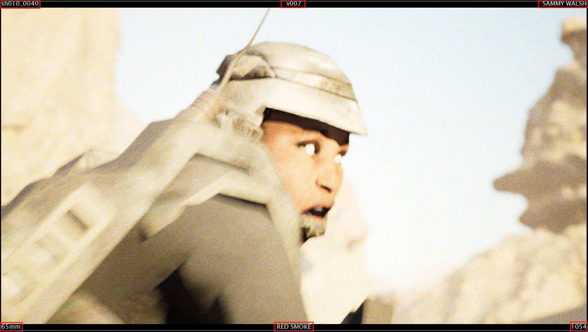
Being able to track shots is key, adding a HUD over the render can present information without interfering with the final image. The HUD is simple but displays all the information I need when editing or reviewing shot versions. It is a basic nuke build, nothing fancy, You build it once and then copy it into each shot as you make it and update the necessary details, such as the shot number, version, and lens.
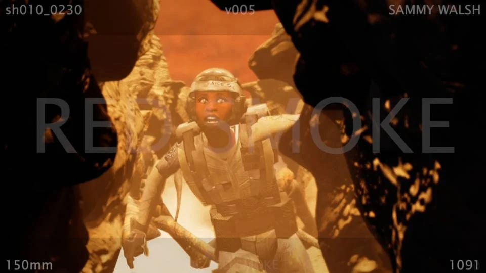
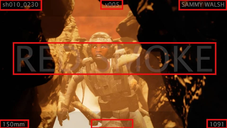
I’ve highlighted the HUD information, you can add as much or as little to your HUD - there is no right or wrong here. The information I decided upon is, Shot Number, Version, Artist, Lens, Name of Show, Frame Counter, and Watermark. Setting this up is easy and just requires a minute to update your shot before exporting.
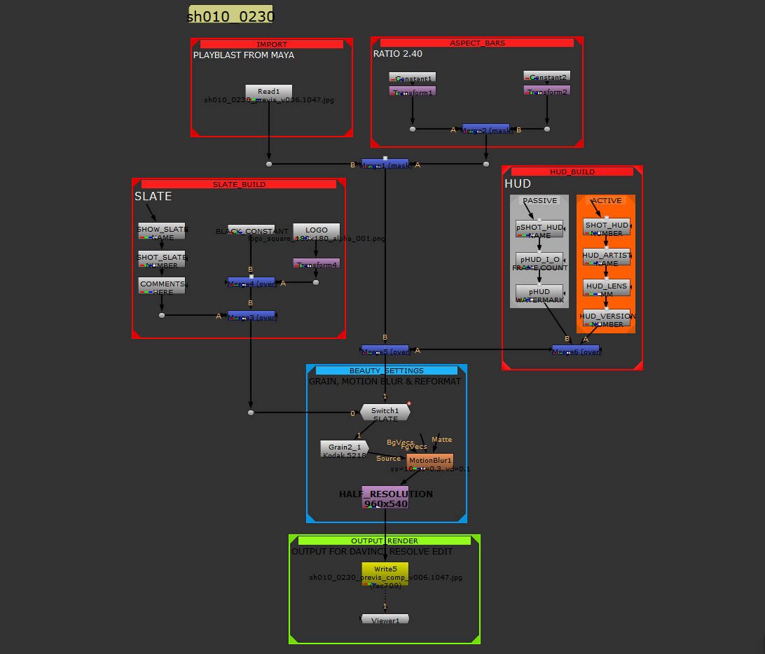
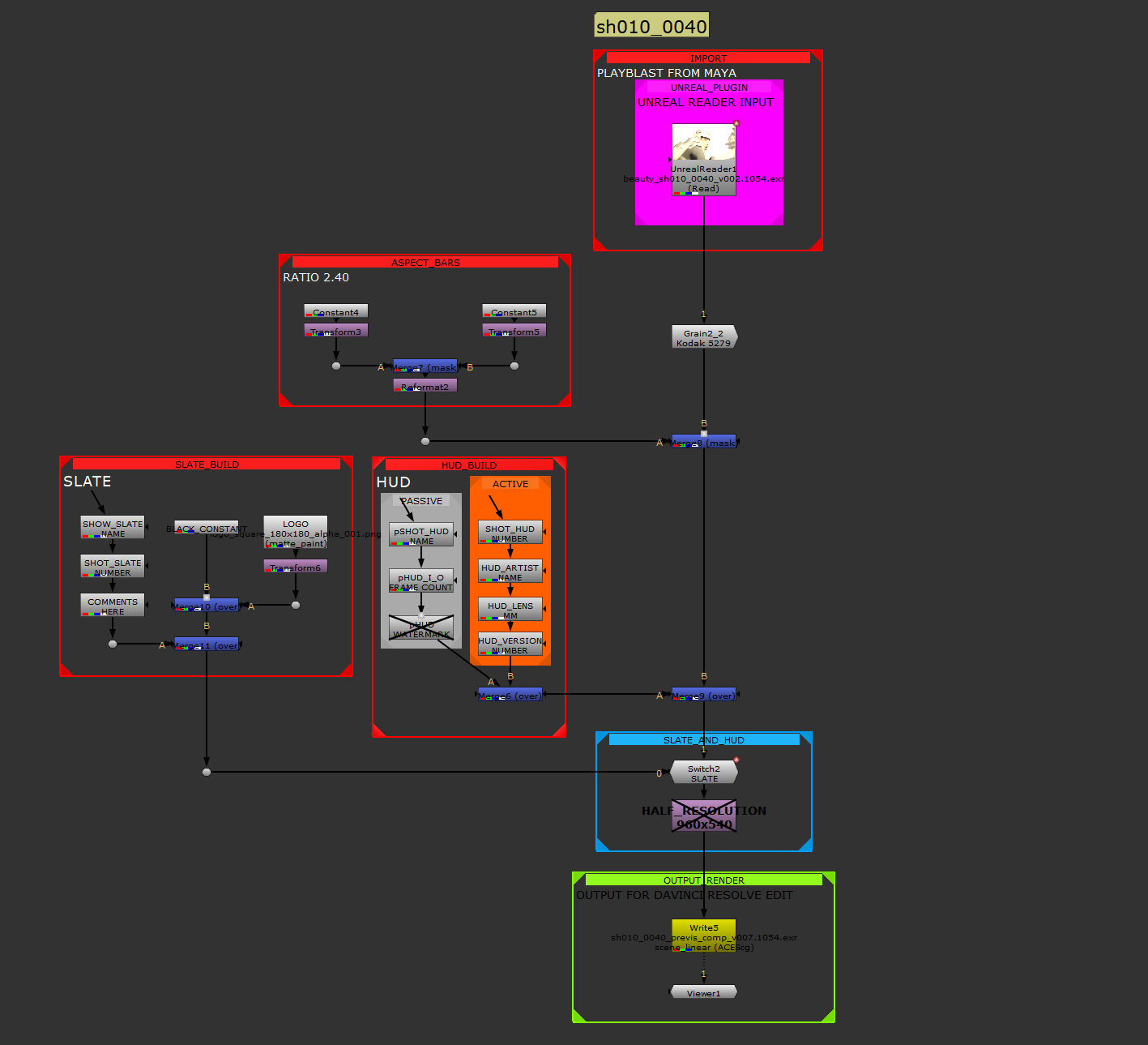
The current HUD tree in Nuke and nothing fancy here. I bring in the blast/render from Maya, and then update the Slate and the HUD nodes and update the export path on disk. I opt to turn the nodes to postage stamp to help speed things up, feel free to leave the nodes displaying a thumbnail, I used to do this on old hardware.
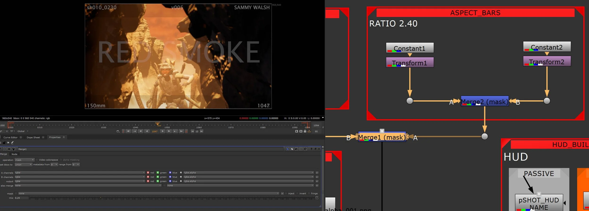
The bars are setup by using two black constant nodes and using a transform to drive their initial starting position - essentially I move the anchor points to start either top or bottom of frame and then scale down from there. I use a second merge to set the opacity. My preferred default is 0.25 but you can make them totally opaque. I normal handle this in the DaVinci edit.
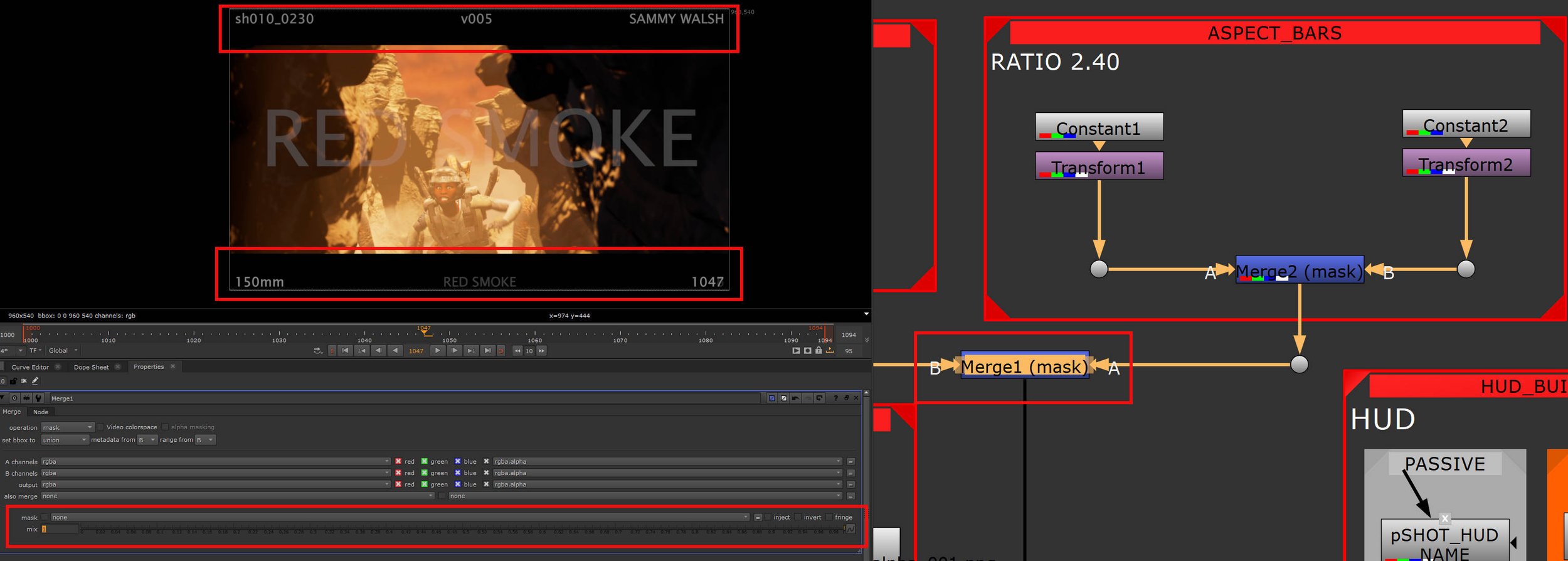
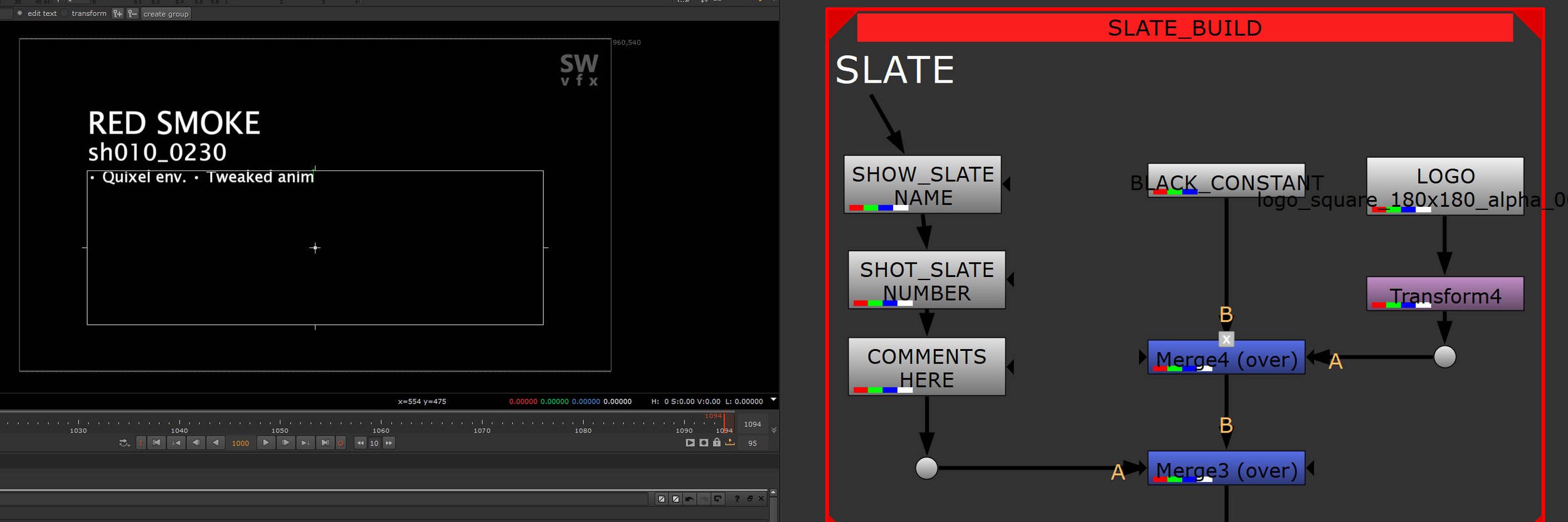
Having a slate is very valuable for review purposes but it can also come in very helpful during edit sessions. It’s really a one-frame container for shot notes. The industry standard frame start is 1001, the slate is made at frame 1000 and a switch node is used at render time. The slate has the name of the show, shot number and some notes about what I was currently working on. Becomes invaluable as I work on this after my working day so It can be helpful to check the slate and see what I was up to. I add my own logo to bring some of my branding into the work.
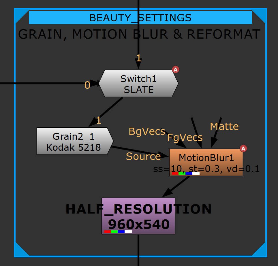
Maya’s viewport blur can often fail and can increase render and playblast times, so I never use it, instead, I do the motion blur in comp. The motion blur node in Nuke is excellent, has great settings, and also if you have a good graphics card you can push the heavy lifting onto that. I also added a little film grain, the CG straight from Maya can always benefit from some help, and finally, a reformat, I don’t normally edit at HD so a quick de-resolution here to 960x540 which helps render speed.
I use a switch node, the slate sits at frame 1000 and I animate between the slate and the shot at frame 1001. Again, this can be set up once and then propagated to your other shots.
I like to add a final reformat at the end, this is more if I want to speed my edit sessions up by bringing in smaller file sizes, the quality dip isn’t huge and the edit is always set to HD so I can simply swap out to the final size if needed. I like to add a grain node here too, nothing big, just a preset that I tweak to fit the look I’m after. CG looks far too clean and Previs by it’s nature is pretty basic, so anything I can do to push it away away from PS2 graphics, I’m all for it.
Something I do like about Nuke, you can simply disable nodes, I designed my trees to have all the lower-end stuff set up and more often, hit D and render, probably not worth it but I like having options.
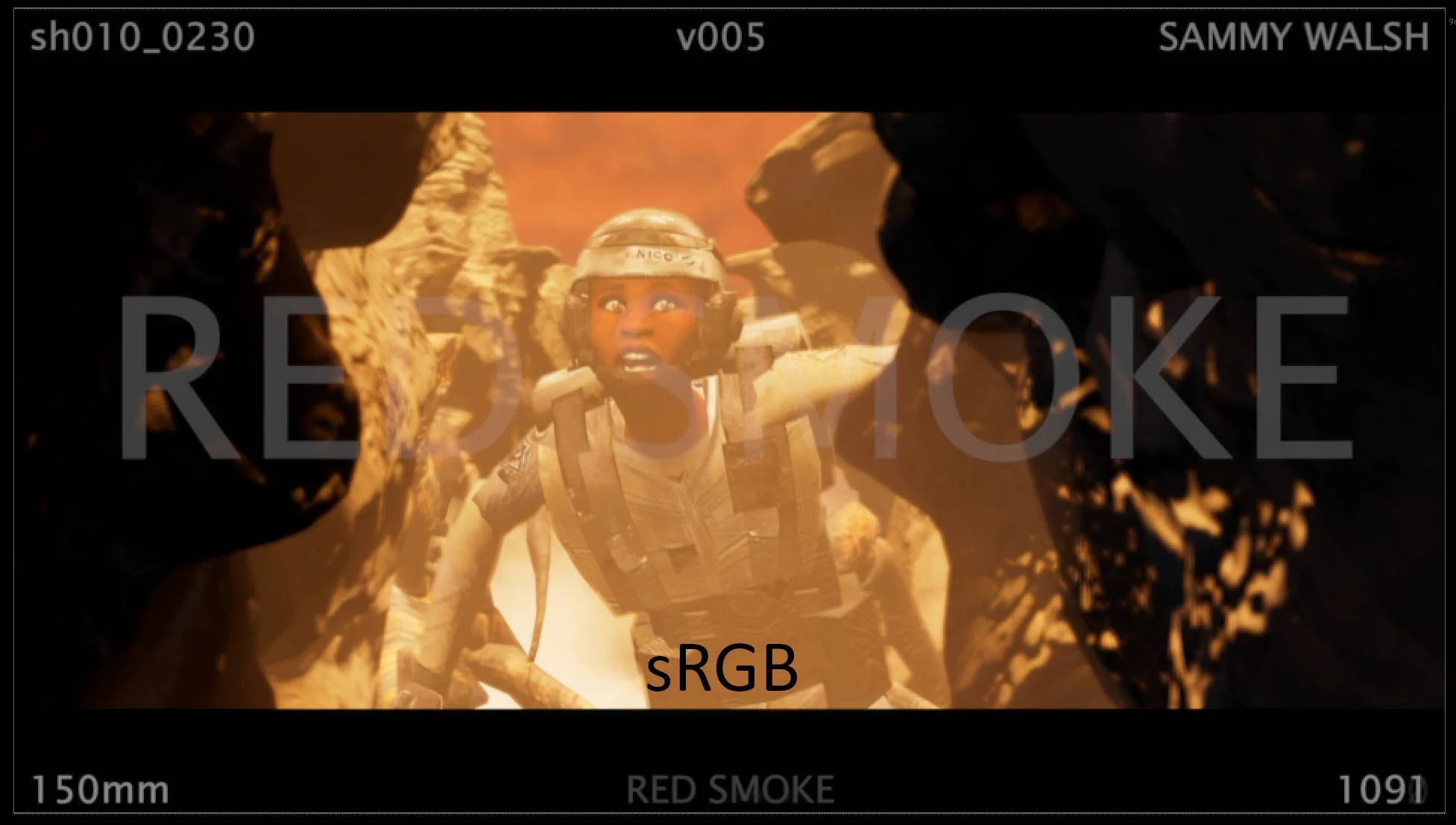
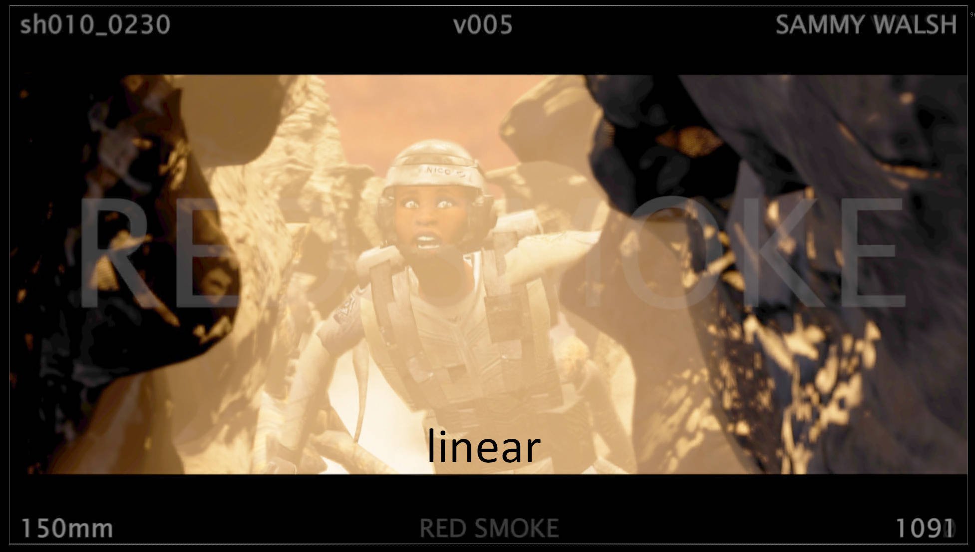
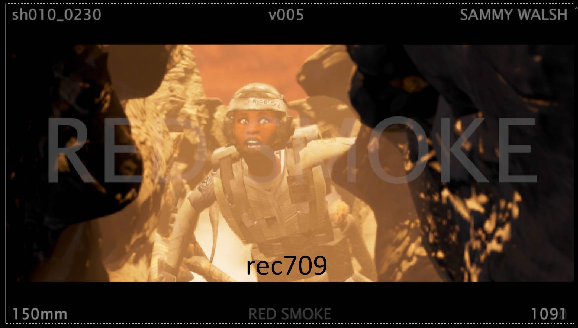
A useful addition to using Nuke for your comp work during previs is that you can start to think about colourspace. It’s not nirmally something visualisation artists have to think about but it can be beneficial to know the settings. Maya has a default colour management profile, once you turn it on that tries to show everything in the viewport as rec709. You can then use that in Nuke to interpret your renders and playblasts. On the read node, change your Input Transform to rec709, feel free to play around with, you can really see how different they all are.
The differences range from subtle to extreme. The sRGB and rec709 are very similar, the rec709 image has a touch more detail in the dark areas. The linear version is blown out. Best to work out your colourspace first and go from there, as long as everything comes out of Nuke at rec709 and then viewed in the edit the same, we are fine. These were my early renders from Maya and once I moved over to Unreal, I solidified my colour workflow.
I revamped my HUD once I started to get into the edit inside DaVinci. A few of the nodes weren’t needed, mainly the blur which Unreal handled very well, and the black bars as I set that up in the edit for better flexibility. I also wanted to reduce the screen real estate that the information was taking up - I squeezed it down to be almost nothing but it’s still there. Also, having it smaller means that I could still do re-racks on the frames if needed. If the HUD did get in the way, I could always return to Nuke and re-render without it.
I often set the opacity on the HUD to almost completely transparent. I made the HUD about 20 pixels in height, it’s previs so I figured a small HUD is better than nothing. With the new improved Nuke tree, I mostly pushed everything over to the left for the HUD so when I came to make bespoke comping tweaks, I could place all of that work on the right and have a clean work area.