
Presentation is a key element in a design, and visualisation is no different. I approach all aspects with the same thought process and consider how the final work will be seen. It could be a poster, a thumbnail, or a title card, all have to feel like they belong. This page is more of an idea dump for the poster, towards the end of the visualisation process I started to produce simple designs that I would use to promote my little visualisation project.
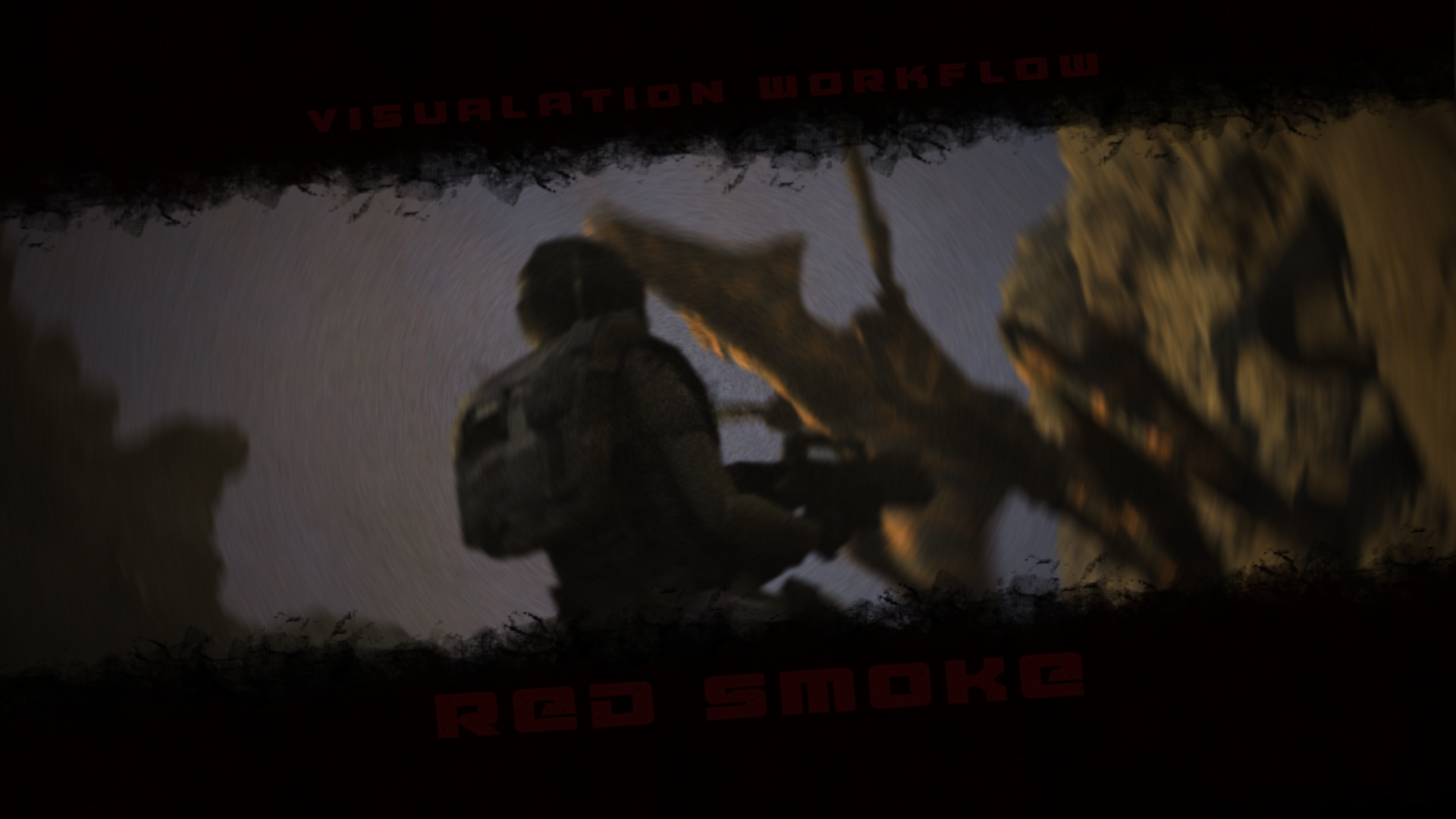
The first couple of designs were from the early Maya blasts of one of my favorite shots and also an early Unreal render from a shot that has now changed considerably. I wanted from the start of this to use a shot as a base for the poster, rather than create something custom, there are several shots I feel could serve as foundations for the poster.
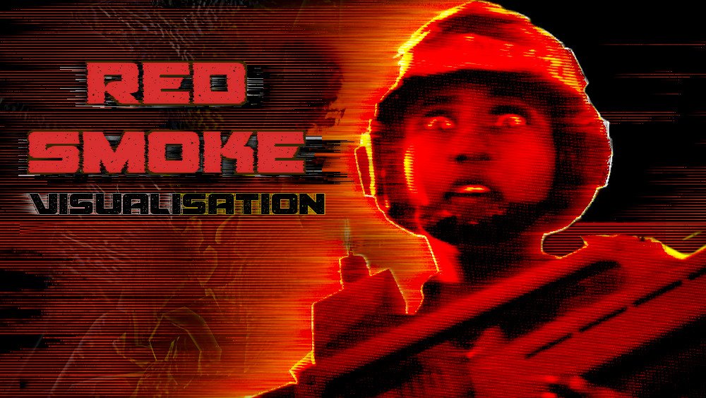
I started to hone in on using the colour red, the film is called Red Smoke, so I felt that I wanted to really push that in the design. I wanted something striking, with a 80’s and 90’s aesthetic but also retain a feeling of my film.


I was looking for something bold, graphic, and rough, I wanted to bring the feeling of dust and smoke from the film to the poster, I had to keep the silhouette of Nico strong as the armour design from the original film is so recognisable, that would help viewers see where my film was originating from. These were grabs from experimentations in Nuke, I would just bring in still frames, grade and play around with the merge operations and layer the textures of the renders together.


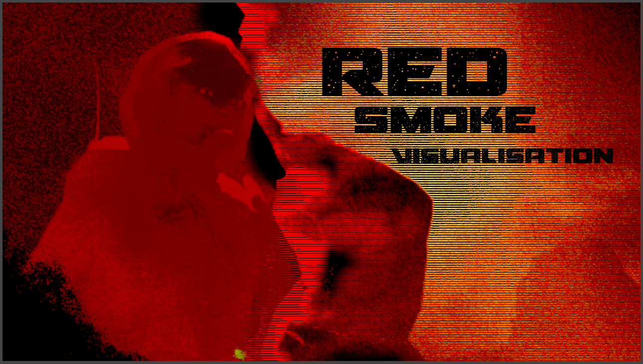
I spent a while in Unreal crafting an interesting photographic look so these were a couple of versions where I was trying to layer up the renders to feel like a graphic process in a old optical printer. The bold coloured background would be ideal for adding the font for the title.
Conscious of the location where the film is set, I was trying ways of adding in the dusty chaos from the flare that takes place at the end of the short, again just layering in a render, removing areas and blending them to see what result I could get. I like to work with filters and blends as it saves on manual painting and also is procedural by nature.
Final Poster Design Workflow


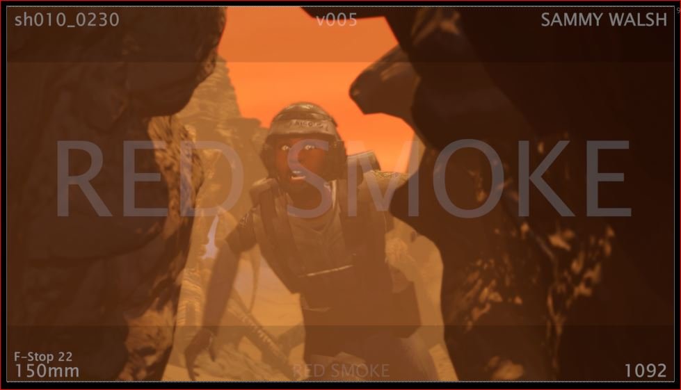
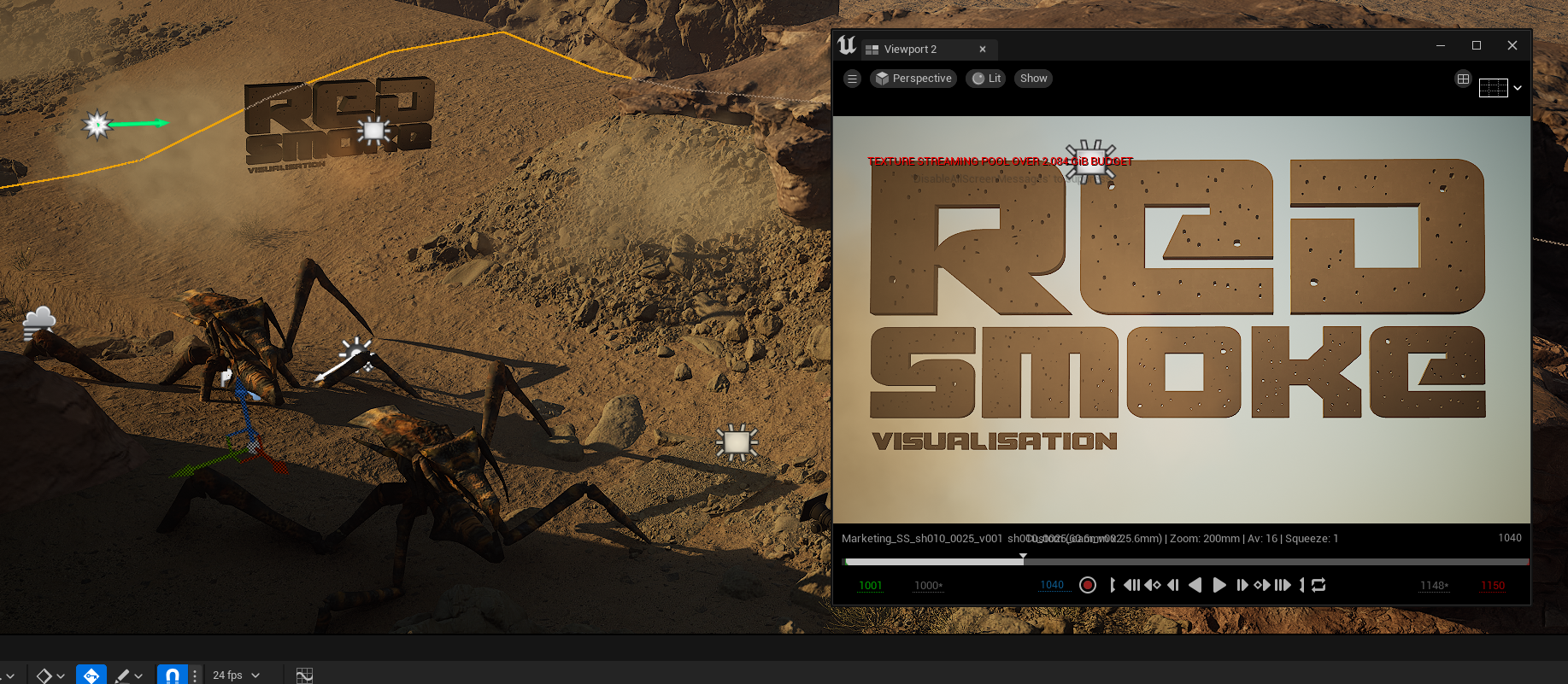
After some back and forth I settled on using this frame from shot 0025, even though the bug isn’t present, it’s probably my favourite shot in the previs edit. I created a copy of the shot in Unreal, and started to tweak it, to give me a better base to start the poster. The first port of call was to kick out the frame with and without motion blur as a base for Gimp.
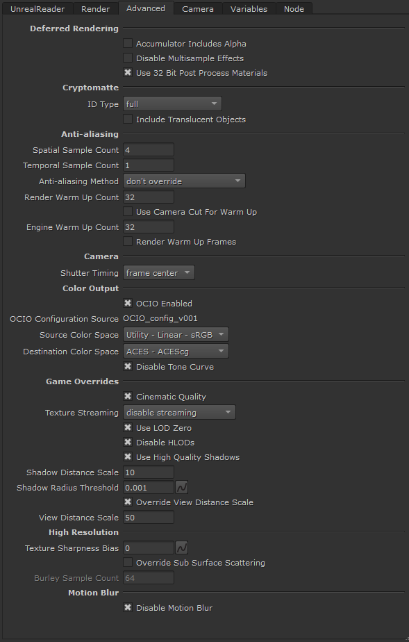
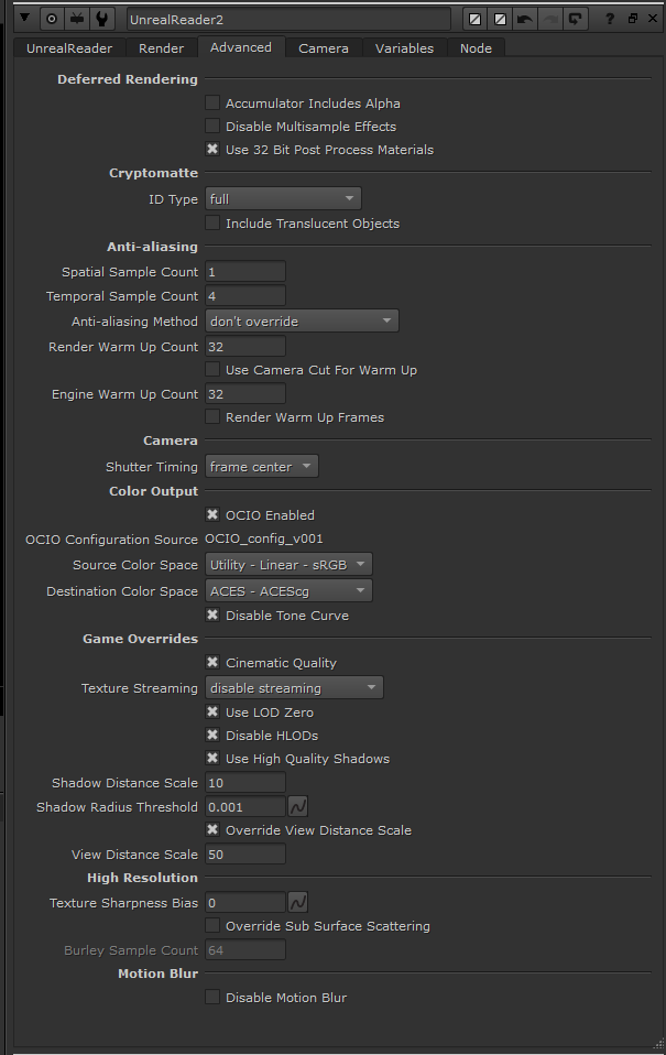
The nuke reader settings for zero motion blur, the reader makes it very easy to switch between settings. Here I turned off motion blur and added and switched the Spatial and Temporal samples around to help with motion blur and also create a better still frame when turned off.
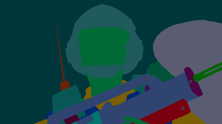

Next I wanted to create a simple matte for Nico so I had a nice clean alpha to start playing around, you could do this in Gimp or Photoshop but as the pass comes along for free using the Reader node, we might as well take advantage of it. All you need to is select the Cryptomatte AOV from the render pass list once render, add a Shuffle Node and then export, make sure you select RGBA or you won’t get the alpha upon export.

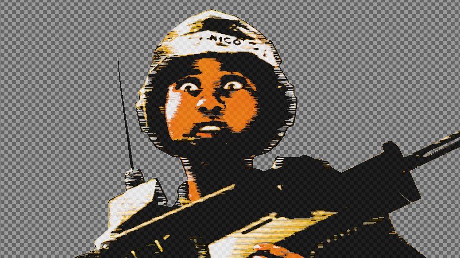


Once you have exported your stills, you can start to experiment. I want to try and be as procedural as possible here, mostly layering filters together. I want to retain the colours from the shot but enhance, them graphically for the promotional still. This is what people see on social and so, I want to push it a little.
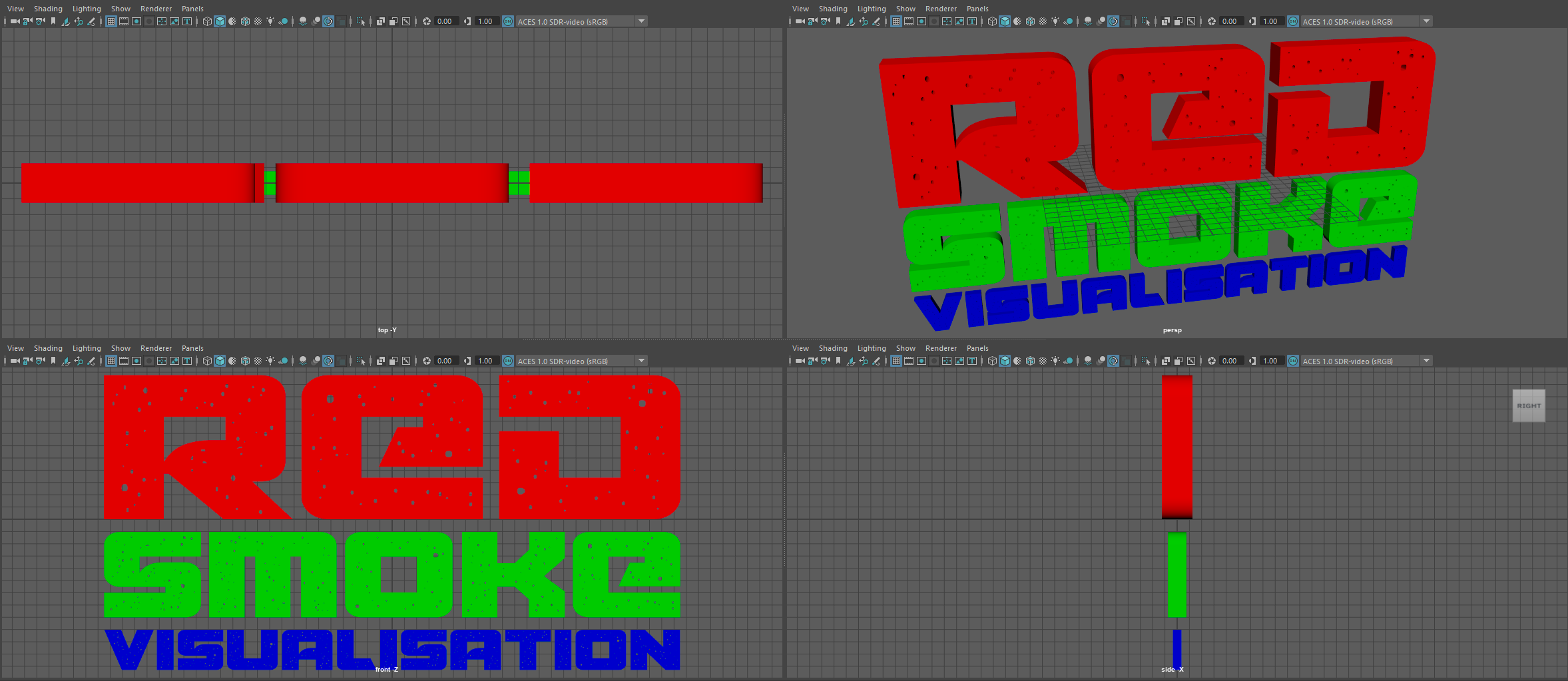
Integrating text into a poster can be a slow process, I often render my text in the same lighting as the rest of the image, if possible. I made my font in Maya, It’s a good idea to give it a once-over to clean and remove broken polygons. Adding materials as normal to allow quick switching inside engine.
Keeping everything organised in Nuke, I also decided to enable the cryptomatte AOV so I could easily isolate the text from the background smoke in Gimp. Super fast way to get text that feels part of the original image and the mattes are invaluable to start layering the still together.

Once the text is import via FBX, I made a new level sequence, filled the shot with smoke, added a megascan material and rendered out to Nuke.

The final designs, I keep the Gimp file clean so I can go back and separate the layers to make more versions of the still for my website. The design will also be used as both the icon and splash for the Unreal project. No one will ever see that but I like to update it, purely for me.
